


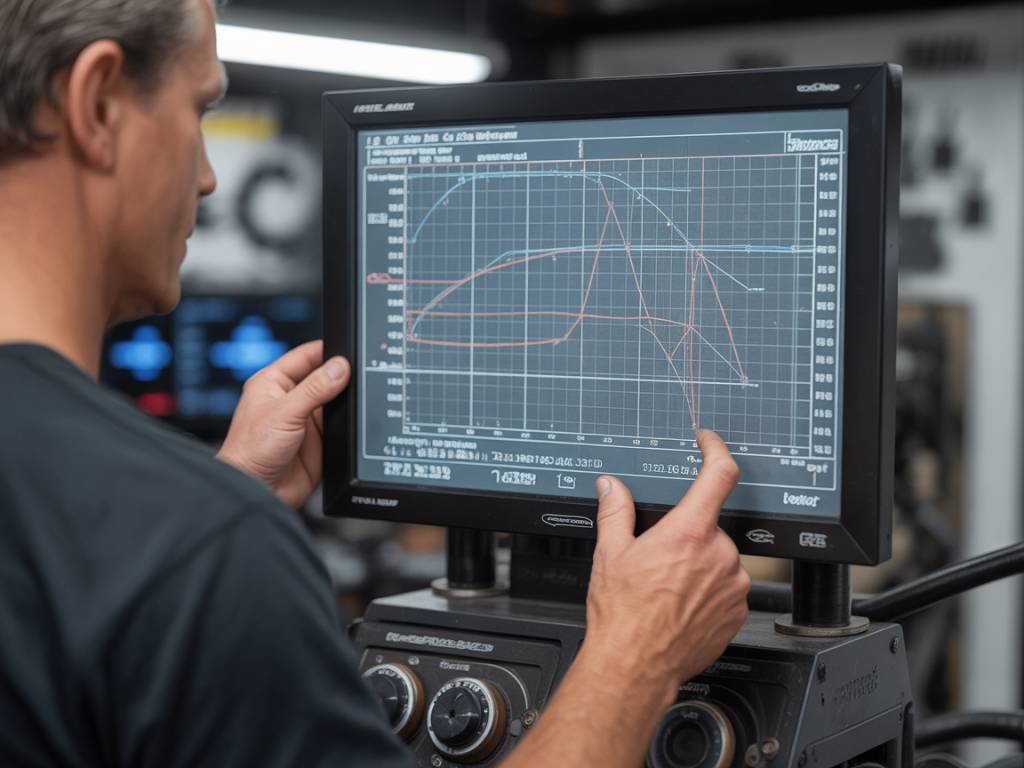
Understanding Dyno Charts: More Than Just Peak Numbers
When it comes to performance tuning, few tools are as critical—or as misunderstood—as the dyno chart. Whether you’re chasing horsepower, torque, or the perfect powerband, understanding how to read a dyno graph is essential. The catch? Most people glance at peak HP and call it a day. Big mistake. If you’re building a street sleeper, a track day monster, or you just want your tuned daily to actually drive better, what happens between the peaks matters just as much.
In this guide, we’re going to dissect a dyno chart with a scalpel—not a sledgehammer. You’ll walk away knowing exactly how to read, interpret, and apply that info to your build in a meaningful way.
What Is a Dyno Chart, Really?
A dyno chart is a graphical representation of your engine’s output—typically showing horsepower and torque plotted against RPM. It’s the result of a controlled test on a chassis or engine dynamometer, simulating real driving conditions to measure performance under load.
It’s typically divided into two curves:
- Horsepower (HP): how fast your engine can do work.
- Torque (lb-ft or Nm): the engine’s rotational force—what you feel in your back when you plant your foot.
Torque and horsepower are not interchangeable, and both play different roles depending on the use case of your vehicle.
Why the Shape of the Curve Beats the Peak Number
Let’s get something straight: peak horsepower may look good on paper and impress your mates, but it tells you almost nothing about how the car feels on the road. Don’t believe me? I’ve dyno’d cars with 500 hp that felt sluggish because the power came in too high—inaccessible unless you’re wringing the engine’s neck. Meanwhile, a 300 hp build with a fat, flat torque curve at 3,000 to 5,000 RPM feels savage on the street.
Focus on the following:
- Powerband: Where in the RPM range the car makes usable power.
- Torque curve: Smooth is better. Spikes can indicate tuning issues or inconsistent fuel delivery.
- RPM spread: Where torque starts to build and when it dies off. That’s your window of usable performance.
Understanding the Axes
Every dyno graph has two main axes:
- X-axis: Engine RPM — from idle up to redline.
- Y-axis (left): Torque — measured in lb-ft or Nm.
- Y-axis (right): Horsepower — because horsepower is a function of torque and RPM, it always follows a calculated curve.
Note: Torque usually peaks before horsepower. That’s normal and expected—torque drops off as revs rise, while horsepower continues climbing because it multiplies with RPM.
Horsepower vs. Torque: Application Matters
So how do you use this information? Depends on what you’re building.
Example 1: Track Build You’re chasing lap times and throttle response. You want a broad, flat torque curve and strong horsepower up high—ideally with minimal lag. A top-heavy HP curve with a late torque rise points to a turbo too big for the setup, or lazy mapping.
Example 2: Daily Driver You want instant response and drivability. Focus on torque in the low-to-mid RPMs. If your chart shows torque falling off a cliff after 4,500 RPM—but you never rev past that in traffic—you’re golden.
Example 3: Drag Racer Here, you’re living in the top of the rev range, so peak power and a high torque ceiling are king. But beware: If the curve is narrow, you’ll be rowing gears constantly.
Interpreting Boost and AFR on Overlay Charts
Dyno shops often provide overlays with boost pressure and air-fuel ratio (AFR) against RPM. If you’re tuning forced induction, these are gold:
- Boost curve: You want a smooth, linear rise. Fluctuations or spikes usually mean inconsistent wastegate control or a poorly tuned boost controller.
- AFR: Rich mixtures (~11.5:1 petrol) at full throttle are typical on turbo cars to prevent detonation. Lean spots indicate danger, especially under boost.
I once tuned a turbo MX-5 with a clean 12 psi setup that looked fine by eye, but on the dyno, we saw a lean spike from 3,800 to 4,200 rpm—literally seconds before detonation. Caught early, we fixed injector scaling and prevented a melted piston. That’s why these overlays matter.
Correction Factors: Don’t Ignore the Fine Print
If you’re comparing dyno results with your mate’s build halfway across the country, make sure you’re looking at the same correction factor. These adjust for altitude, temperature and atmospheric pressure. The most common ones you’ll see:
- SAE: Used in North America. Conservative and standardised.
- DIN: Common in Europe. Slightly more generous figures.
- Uncorrected: Raw data based on real-time conditions on the day. Good for bragging rights, not for comparison.
If you’re serious about tuning, always ask the dyno operator which correction factor was used and make sure it’s consistent when comparing runs.
Before and After Comparisons: What to Watch For
There’s nothing like a side-by-side graph to validate a mod—whether it’s a new intake manifold, freer-flowing exhaust or ECU reflash. But don’t just look at the peaks.
Here’s a checklist I use when reviewing back-to-back dynos:
- Has torque improved across the usable range—or just at the top end?
- Any weird dips or flat spots post-install? Could indicate fueling or ignition issues.
- Where has spool time changed (on turbo builds)? Earlier is almost always better.
- Engine smoothness: A bumpier curve can mean knock, misfire or tuning instability.
Tires, Gearing, and Dyno Type: The Hidden Variables
All dynos are not created equal. That 400 HP on a DynoJet may read closer to 370 HP on a Mustang dyno, and even lower on a Maha or SuperFlow. Why? Different load calculations, roller resistance, and drivetrain losses.
And let’s not forget tire setup. I’ve seen 10–15 hp differences simply by swapping from sticky R-comp tires to street tires due to rolling resistance.
If you’re switching tires, gear ratios, or dyno types between runs—good luck comparing the numbers accurately.
What Dyno Graphs Can’t Tell You
As much as I love a good dyno session, be realistic: numbers on a graph don’t tell you everything. They can’t measure throttle response, pedal feel, turbo latency under real load, or how your gearbox behaves between shifts.
I’ve driven “400 hp” builds that felt like wet noodles on the road, and others that made modest power but delivered it so seamlessly they felt faster. Don’t tune for the chart—tune for the result.
Making Sense of the Madness
A dyno chart isn’t just a brag sheet—it’s a diagnostic tool. Used right, it can tell you what’s working, what’s not, and where you need to focus your next round of mods. Start reading between the RPM lines and stop chasing peak HP numbers like a magpie with a sandwich wrapper.
So next time you get a dyno readout, don’t just scan for the biggest number. Trace the torque, review the ramp-up, compare runs methodically, and cross-check boost and AFR. That’s how you build a setup that not only pulls hard—but pulls smart.
Got a dyno graph you want analyzed? Drop it in the comments and let’s talk about what it’s really telling you.